Your website should be a huge sales magnet for your business. Just like a salesperson in store, the roll of your website is to “talk” to your customers about what your business does, what value your products or services offer and how that value can help solve a problem or interest of your customer. While it is important to have an aesthetically beautiful website and one that is functional, getting the messaging and branding correct can make a huge difference in whether your potential customers convert or not.
The key elements you need to cover in your website messaging are:
- Communicating at a very high level what your business does
- Describing how your business is different and how this helps solve a problem or heighten the interest of your target market
- Delivering on expectations
The Steps to Creating Your Website Messaging
1. Communicating what your business does
Sounds simple, right? You might think so – but that’s coming from the point-of-view of someone who works in and knows the business inside and out. Put yourself in a person’s shoes that has never engaged with your brand, product or service before. If they landed on your website, would they understand exactly what your business does?
Here are a few examples.
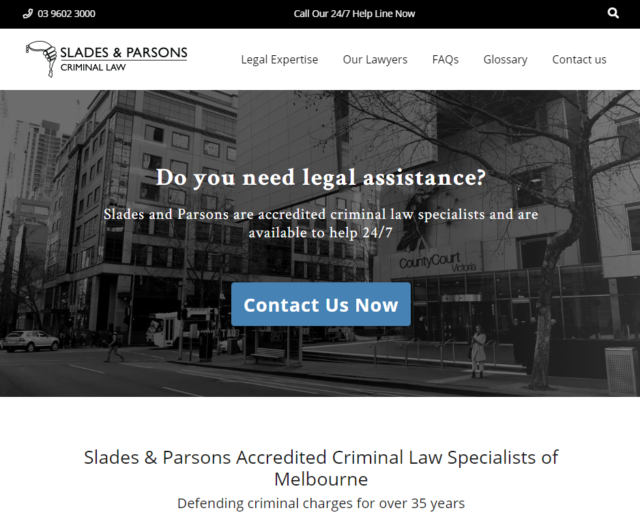
Even if you have never heard of Slades & Parsons before, the elevator pitch on their homepage is short, concise and in just a few words describes exactly what they do.
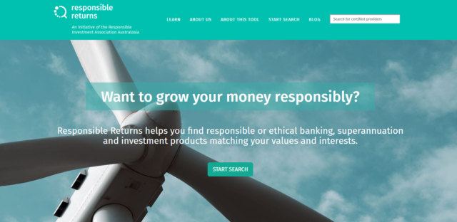
Above is another example from Responsible Returns. Once again, you don’t have to have heard about their brand or offering before. The messaging tells you exactly what it is they do.
Here’s a great way to get started with developing (or improving) your elevator pitch. Think about when you go to a meetup, conference or even in social settings with friends. What is it that you tell people that your business does?
Let’s refer back to the example above for Responsible Returns. Imagine meeting someone at a meetup that says they work for Responsible Returns. You then ask, “What do you do there?” and they’ll probably reply with something along the lines of, “We find ethical banking, superannuation and investment products that match investors values and interests.” Sound familiar? Just look at how closely that ties into their website pitch. It’s clear, its concise, and it tells visitors exactly what the business does.
2. What Sets Your Business Apart
Let’s be straight – no matter what industry you’re in and what product or service it is that you offer, chances are there are competitor businesses that, at their core, offer exactly the same product or service as you. So why should a prospect customer buy from you and not them? This is where identifying and understanding your unique selling propositions (USP) come into play.
A USP can take many forms. Some common ones are higher quality, lower price, better customer experience or a new innovation. Referring back to the Slades & Parsons example above, two of their USPs are described in their elevator pitch: (1) they are specialists, and (2) they are available 24/7.
You can follow these steps to get started with setting your business apart through website messaging:
- Outline your USP (most businesses will have a number of them, so write them all down)
- Identify who your target market / target persona is (note that this might be different for specific landing pages)
- Put yourself in the shoes of your target persona. What problems are they likely to be facing? Pain points? What interests do they have?
- Match the problems, pain points or interests identified to one or two of your USPs
- These are the USPs to use in your website messaging. Communicate them not through a direct sales pitch but through selling the idea that your product or service can help address this issue or interest.
3. Delivering On Expectations
The final step in developing website messaging that converts is ensuring your deliver on expectations 110% of the time. Whatever it is that you are promising needs to come through to fruition for your customers.
Referring back to the examples above – Imagine if you were in need of legal assistance and tried to contact Slades & Parsons at 3am (after all, its 24/7 support, right?) and they didn’t answer your call. Your trust in the brand will be immediately diminished. Likewise, imagine if you were actively seeking ethical investment options, jumped on Responsible Returns and were provided with a recommended superannuation fund that on further research from yourself, identified that they weren’t actually ethical in their practises, severely diminished trust in the brand.
Delivering on your USP should be at the backbone of your business, but once you begin actively promoting this, it’s incredibly important that you meet those expectations, time and time again.
Optimising your Website Messaging
Website messaging isn’t a “set-and-forget” task. If you want to get the most out of your website messaging, and ensure it’s converting as best as possible, you need to continually test and optimise. A/B testing can achieve this. This type of testing is the process of testing an element of your website messaging to determine better ways to convert. A/B testing usually involves 50% of your visitors seeing one version and the other half seeing the other (or an even split between multiple tests if you set up more than 2 test variants). From these variations, you can see if one test variant is more effective than the other(s) at converting customers. The most effective one can then be implemented, and tested against different variants again (and the cycle continues!).
Here are some examples of A/B tests you may want to implement to test and optimise various elements of your website messaging:
- Elevator pitch
- CTA button text that sits with the elevator pitch
- The USPs you call out
- The image(s) you use to support your messaging (remembering that images are a huge part of your website messaging)
- Home page messaging (including USP)
- Landing page messaging (including USP)
You can also read more about increasing conversions through A/B testing here.
Summary
In summary, getting the correct website messaging can drastically help improve conversions and in turn, improve ROI. Getting the messaging right isn’t as simple as creating it and leaving it. As with any optimisations, website messaging needs to be continuously tested and optimised to ensure you are always getting the best results possible. A/B testing should form a large part of your monthly or quarterly marketing activities to ensure your messaging is optimised at its best to increase conversions.
Not sure where to start or maybe short on time to manage continuous A/B testing? That’s where we can help. We’re experts in CRO and can help identify ways to assist in improving your conversion rate. Let’s catch up for a coffee and chat! Contact us today.


